Heaven FBA
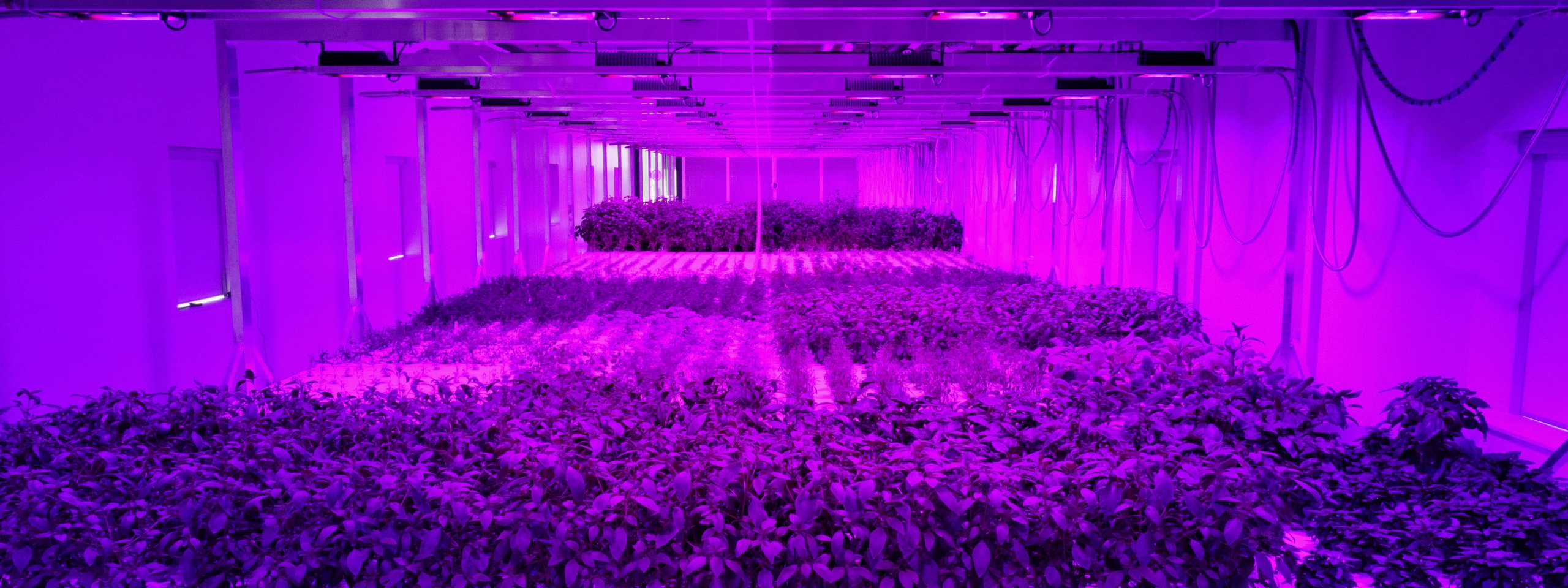
Stands for food that is grown in energy efficient, modular indoor farms: using 90% less water and zero pesticides. Grown locally in order to reduce transportation and pollution. Harvested at the perfect time, fresh and ripe. Accessible, nutritious, tasty and affordable. They are growing the food every human has the right to eat.

Overview
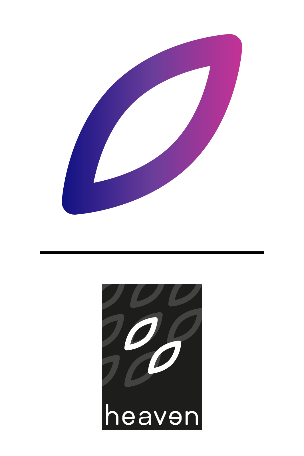
Project designed by KACE, in association with Ton Tesink B.V. — [en] The heaven logo is simple and yet distinctive. It combines a pictogram and a word. The word “heaven” is set in monospaced. Whereby the letter “e” has been mirrored and all the letters have been carefully spaced. It is essential that the logo is used correctly and consistently in all forms and communication. It should never be redrawn or modified. The logo should only be reproduced in the authorised colour palette in its positive or negative form.
We created a pattern which represents all our crops. Washed with the perfect balance, always with a lot of attention and very carefully chosen. They are more or less the tastiest tops in the food chain. To add extra identity this pattern is gradually being used.
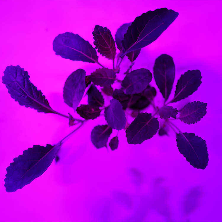
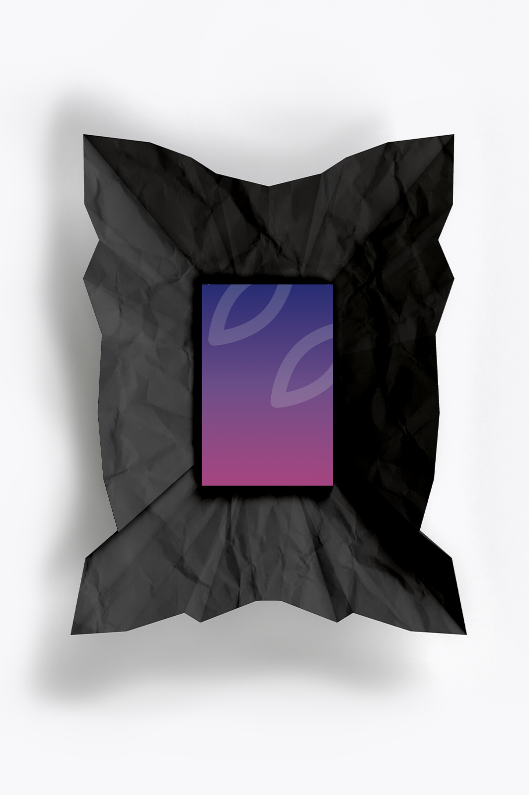
The colours are an important part of the heaven identity as they are linked to the LED system. We have made a primair colour pallete, as a secundair colour pallete as well. The Heaven identity is very clean which makes a high attention to detail even more important. Photography adds to the experience of the brand and can provide a more emotional aspect in contrast to functional typography.
—


Heaven is on a mission to contribute to a world where everybody will have access to secure and safe food.


